During winter, I have no interest in either decorating or wearing clothes with any flair. My only concerns revolve around staying warm. I care not the state of my wardrobe, as long as it covers me head to toe in multiple, insulating layers. My home’s appearance interests me none, save the aspects that impact heat retention. Decoration and modification are not activities of winter. The wearing of expressive garments is not my cold-weather habit. These aspects of my life spring forth only when the temperatures climb and the days lengthen. We are finally there.
Color has returned to my attention. I look around my home and begin to notice objects in shops, online or on the sides of the road that would coordinate nicely with my décor. I think about minor adjustments to my current decorating scheme to accommodate new objets d’artes So, I turn my thoughts and reflections to the arena of color, for this seems to be the driving factor in my decoration purchases.
Although I find form and texture to be very important, color is generally the deciding criterion for a new home décor purchase. Artists hate this attitude, but color is the feature of a painting to which I am first attracted, it is the visual blast of shades in a photograph or image draw my eye. Secondarily will I examine the subject of the piece. No, I am not an art snob. Does the color pallette please me? Yes? – here’s my credit card.
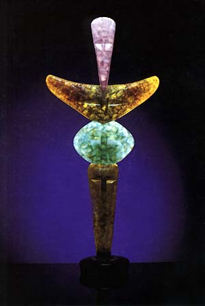 Right now, I am waiting a return email from a gallery concerning a piece that I viewed on their website. What drew my eye – the colors of the piece. Orange-red, green, lavender and clear glass formed into a Totem. Yes, I like the lines – clean and simple. Yes, I appreciate the texture of the glass and stone. But, the color is what caused my fingers to email the gallery inquiring about price and availability. If the piece were in shades of blues, say, I would never have given it a second look…
But, I cannot set in stone a pallette of colors that I universally love beyond all others. I do have favorites, but I am known to pass over these in favor of others in certain circumstances. There is, I guess, certain unconscious criteria that I use to assign acceptable color to a given object or form. Only those colors matching my acceptable list will be tolerated on the object if I am to add it to my home. And, that pallette is dynamic. For some things, a wash of colors from the deep are the right fit. Rich and vibrant navy, violet, kelp green…the colors of the ocean depths. For other things, the brights of a summer’s day are what are required – sunny yellow, fiery orange, plump pinks and bright blues. Some objects seem to beg for the comforting shades of autumn…robust golds, princely browns and radiant reds…
As a rule, my home is plentiful in Earth tones. Those are the ones to which I normally gravitate. I wear these colors, although they do not flatter my skin and I tend towards these in the jewelry that I buy. Citrines, spinels, peridot…however, some objects and rooms have called for different shades. My guest room is festooned with blue, yellow, white, and splashes of pink and orange in the various flower prints adorning the walls. A sharp contrast to my bedroom, which is rich in deep orange, green, black and brown. The bathroom is lighter tones of the Earth and the kitchen is bright shades of the world. The living room is a pleasing combination. The colors are primarily dark, but the rainbow is represented – burgundy, blue, green, gold, brown, orange…silhouetted against walls of pure cream. Actually contrast dominates the walls in that room – I have in that room no “pictures.” My wall decoration is a body of dark forms chosen first for the color contrast with the walls and secondarily for their forms.
My one room without color character is my third-floor bedroom. Actually that room has no personality at this point in time. I made sure that the rooms in which I would spend my time and my guests would see were decorated. I have not yet decided what will be the function of that room. It will house guests, if I have more than my “guest room” will sleep, but it should multitask. A craft room? A room devoted to Tiki? A library? An office? Until I know its form, I cannot know its color. It is a devilment. I have no incentive to buy one thing for that room; to provide any decoration…until it has a personality, I cannot dress it.
Color is on my mind today. The sun is shining and the colors of nature are more noticeable than they have been in recent days. The grey lenses have been lifted and the alien sunshine is again exerting its mind control, outdoing the Crayola company for presenting us with tantalizing color. Today, I think about my walls, my curtains, my clothing, my dinnerware, my silk plants, my knicks and knacks and reflect on their colors. Is it time to shake up the bag? Rotate palettes between rooms. Add a splash of bright yellow to my bedroom…anchor the guest room colors with some grounding black…a small bit of sparkling silver set upon the mantle…Color is on my mind today. Perhaps it is time to flash some green and refresh the tattoos of my living space.
No comments:
Post a Comment